Storybooks provide the ability to embed content in a dynamic layout (asymmetrical or grid, stacked or with a slider) to create compelling and engaging content for consumers.
Like a carousel, storybooks allow you to create unique merchandising experiences, blending together products, categories, articles and images as well as linking to templates in your experience to tell a story. Storybooks provide much more flexibility than carousels on the layout of this content.
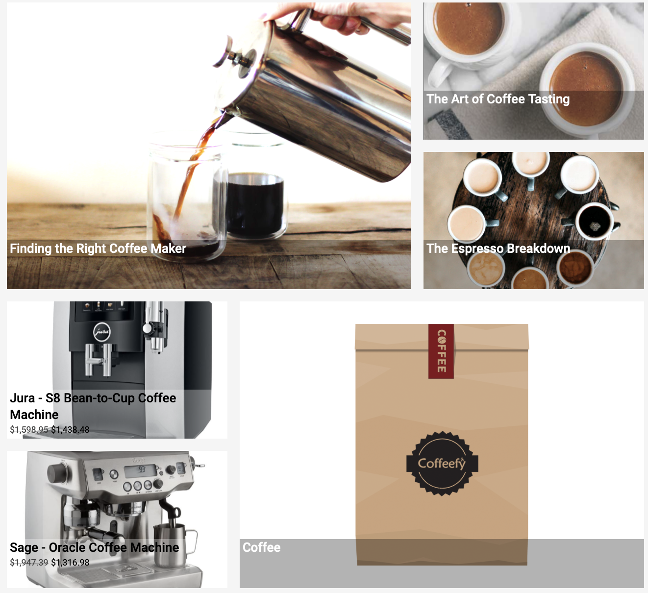
In the example below, the merchant has created an asymmetric layout with 1 highlighted image (on the left) and two detail images on the right, with each image linking to an article, product or category.
Workbench Quick Guide
- Go to Editions and select Storybooks.
- Click + Storybook and add content to the storybook. As you add content to the storybook, you will see a preview of the images on the right hand side. You can either use the default images for the linked product, category or article or you can choose different images using Customize image. In addition, you can configure headlines, sub-headlines and link text.
- You can add a storybook component anywhere in your experience (product browse, home, etc.) and choose how you want it to display, what the layout will be and certain product behaviors (such as ATP check on products). You can choose which fields to display on the storybook component, or the individual products, categories, articles, templates and default templates featured in the storybook. You can also change its layout. As you toggle between asymmetrical and grid layout types, the experience preview on the left will reflect the layout you have chosen.
- In Editions > Storybooks, you can assign your Storybook content to your experience.